
User Guide & Documentation
This guide explains how to prepare your data and use the Causal Exploring tool to run a causal analysis on your dataset.
Step 1: Prepare your CSV file
Your dataset must meet the following requirements before uploading to ensure successful analysis:
- Format: CSV file only.
- First row: Variable names (column headers). If your CSV includes row index numbers as the first column, you can leave the first header blank (e.g. starting with a comma like
,var1,var2). - Values: All data must be numeric (either continuous floats or integer codes). Any categorical text fields (e.g.
"male"/"female") must be pre-encoded into numeric values (e.g.,1/2). - Missing values: No blank cells or missing values (
NaN/NA) are allowed. Ensure your data is fully complete and clean beforehand. - Separator: Comma (
,) or semicolon (;) separators are both supported.
Step 2: Upload your dataset
Navigate to the Home page and drag and drop your CSV file into the upload zone, or click the zone to open a file selector. Only CSV files are accepted. Once uploaded, verify that your file is correctly detected before proceeding.
Step 3: Select an algorithm
Choose one of the three available causal discovery algorithms:
- PC-Stable — reliable and fast, good default choice
- MRPC — if you have prior knowledge about your variables
- MMHC — if your dataset is noisy or has many variables
Step 4: Run the analysis
Click the Run Analysis button. The tool will process your dataset and display the resulting causal graph on the Results page. Nodes represent your variables, and directed edges represent inferred causal relationships between them.
Step 5: Understand the causal graph
Every algorithm rebuilds the graph across many bootstrap replications (resampled subsets of your data) and keeps only the links that show up consistently. The graph legend below explains what each visual cue means.
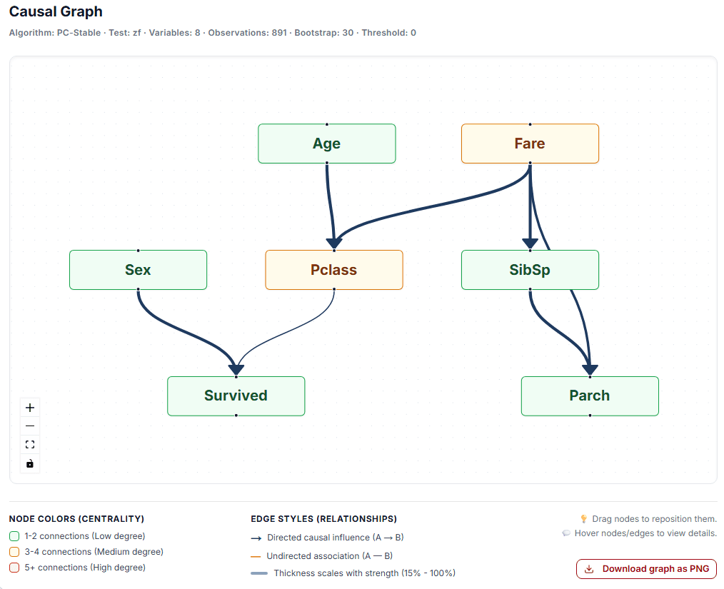
Example: causal graph generated from the Titanic dataset using the PC-Stable algorithm.
Graph legend
Reading the graph
- Directed edge (A → B): across bootstrap replications, the algorithm consistently found evidence that this link exists and that it points from A to B.
- Undirected edge (A — B): the algorithm found a reliable association between the two variables, but could not confidently determine which one influences the other.
- Strength (%): the proportion of bootstrap replications in which this exact link appeared. Values close to 100% indicate a very stable, robust link; lower values mean the link was only found in some resamples of the data.
- Direction (%): shown only for directed edges — given that the link exists, this is the confidence that it runs from the source to the target rather than the opposite way.
- Threshold: displayed above the graph, this is the minimum strength a link needs to be included in the main graph and the Arcs Summary table. Enable "Show all tested links" on the Results page to also see weaker relationships that fell below this threshold.
- Node color reflects how many links a variable has (its centrality in the graph), not its causal importance on its own — a highly connected node is simply a hub worth paying closer attention to.
Note on data quality: Ensure that your theoretical framework supports the assumptions required by the selected algorithm before interpreting the results.